branding and marketing
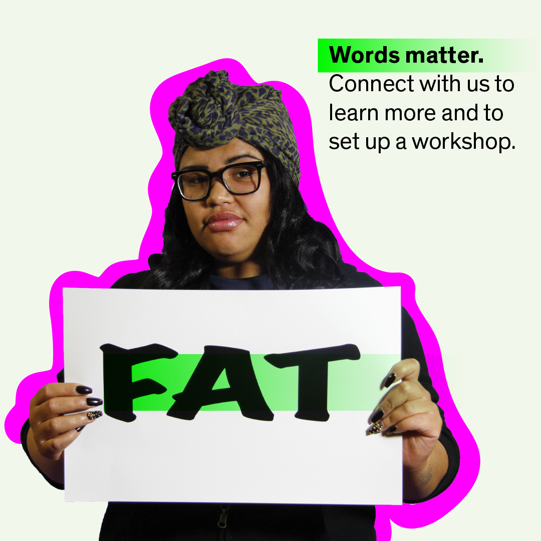
When possible, I like to be actively engaged in the development of programming. I love the process of development, and from a design perspective, I can chase the perfect element to bring it all together through this explorative phase. In the case of Words Matter! there were many design elements to think about: a poster series, a web campaign, and a workshop presentation. For a long time I messed around with the “M” form and “W” form, and I’ve seen many successful examples of this, but it was never quite pulling all the pieces together. Instead, my final form ended with a simple highlighter aesthetic. Within the academic setting, this is a familiar intervention. The programmatic intention of the workshop was to highlight phrases or sayings that are culturally familiar. But instead of automatic acceptance, the workshop teaches how to pause, and notice.
As a designer, I think of my output as my reaction to content. In the case of a
bridge program

I have also started illustrating more, personally and

Lastly, I think about the user, the audience. In the case of a